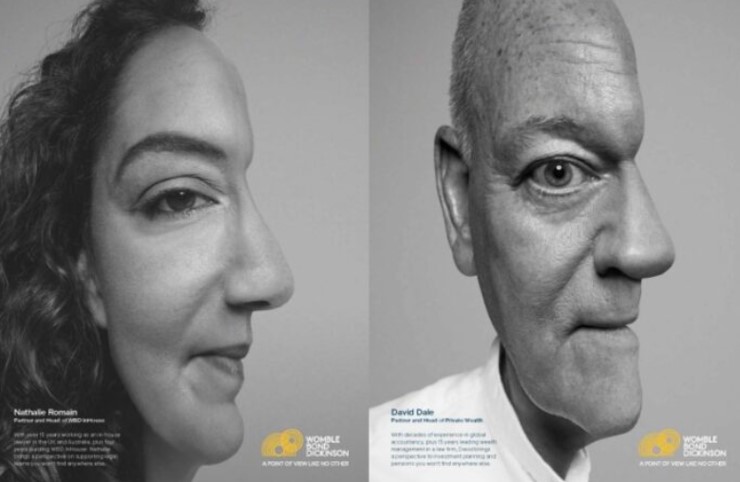
It’s rare for me to get involved in visual identity reviews these days but today I was helping a law firm client prepare a brief for a pragmatic visual identity refresh following a strategic review and a new web site. Interestingly, the bit where we address the brand fell between the overall strategic review and the communications review. And things were further complicated by the changes prompted by conversion to LLP status. Visual identities are tricky – especially when divorced from a brand review.
And yesterday I was talking to a small, local estate agent about how – when they set up in 1994 they wanted their visual identity to convey “trustworthy, established and professional” but as they grew, became more successful, expanded into other areas and moved into the Internet space they needed to stress different things such as “modern, approachable, experienced and local”.
Preparing the brief itself is the easy bit. Trying to articulate your firm’s mission or vision, its values, its brand and the core messages you wish to convey to each of the markets you serve is somewhat trickier. Those who attempt to please everyone end up with a dull identity, the like of which has been used countless times before in their sector.
In the midst of all the many issues for an identity review, I want to focus on two things – the need for a compelling mission and the use of colour.
Create a compelling mission
There are many ways to tackle the development of a mission in the management book I am writing at present for the property industry. However, I really like the work of Jim Collins in “Good to great”. He talks about the need to find a BHAG – “big, hairy audacious goal” (typically symbolised as a hedgehog) which is achieved through considering three things: 1. What are you deeply passionate about? 2. What drives your economic engine? 3. What can you be the best in the world at? Your mission should be the foundation on which your identity is built.
Psychology of colour
Looking at a page of banner ads on a leading legal web site, I was struck by how many companies and firms use blue as their corporate colour (please note that I am firmly in the red camp!). So what do colours convey? I saw some general research recently which offered the following insights:
- Non primary colours are more calming that primary colours
- Blue is the most calming of the primary colours, followed closely by a lighter red
- Yellow invokes cheerfulness (houses with yellow trim or flowers sell faster)
- Red trim is used in bars and casinos because it can cause people to lose track of time
- Red makes food more appealing and influences people to eat more
- Forest green and burgundy appeal to the wealthiest 3%
- Orange is often used to make an expensive item seem less expensive
- White is typically associated with cool, clean and fresh
- Black is associated with elegance and sophistication
Then, of course, there is the issue of what works well on the “young” Internet environment on screen might not necessarily be best for office interiors, printed materials, staff uniforms, posters and hoardings and merchandise bearing your name.
I then wondered what would happen if you linked the colours in your visual identity, to say, a colour analysis of your people (many law firms support good internal relationships by promoting understanding of the different personalities and behaviours of their “red”, “blue”, “green” and “yellow” colleagues)?


